
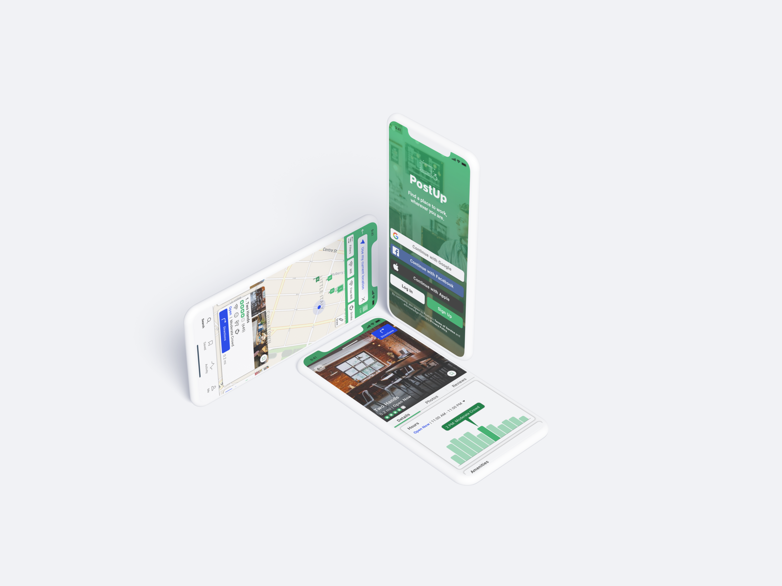
PostUp
PostUp is a mobile iOS app that makes it easier for remote workers to find great public places to work. With a monthly fee, users can access a full directory of options for easy, on-the-go searching. Users can filter by personal preferences to find and get directions to the perfect place to “post up”. This challenge was part of a 5 day design sprint.
My Role: Sole Product Designer
Tools Used: Sketch, Adobe Illustrator, Miro, Marvel
Duration: 5 days
CHALLENGE
Helping remote workers find a place to “PostUp”

There’s a 159% increase in people who are working remotely from 2005 to 2017. The rate of remote workers continue to grow at an increasing rate. Where do they work?
Public spaces like cafes, libraries, etc. Not all places are the same and are easy to work at.
Remote workers and freelancers spend way too much time finding the right public space to do work.

How do we help remote workers find the right place to work at?
SOLUTION
Full directory of searchable places
With a monthly fee, users can access a full directory of options for easy, on-the-go searching.
Users can filter by personal preferences to find and get directions to the perfect place to “post up”.
They can read verified reviews from fellow remote workers to get a better idea of the place before committing to a location.

PROCESS
5 day sprint

DAY 1
Understand the Problem
↓

DAY 2
Brainstorm/Sketch
↓

DAY 3
Deciding on a Solution
↓

DAY 4
Prototyping
↓

DAY 5
Usability Testing
Day 1 - Understand The Problem

Insights Gathered from Interviews
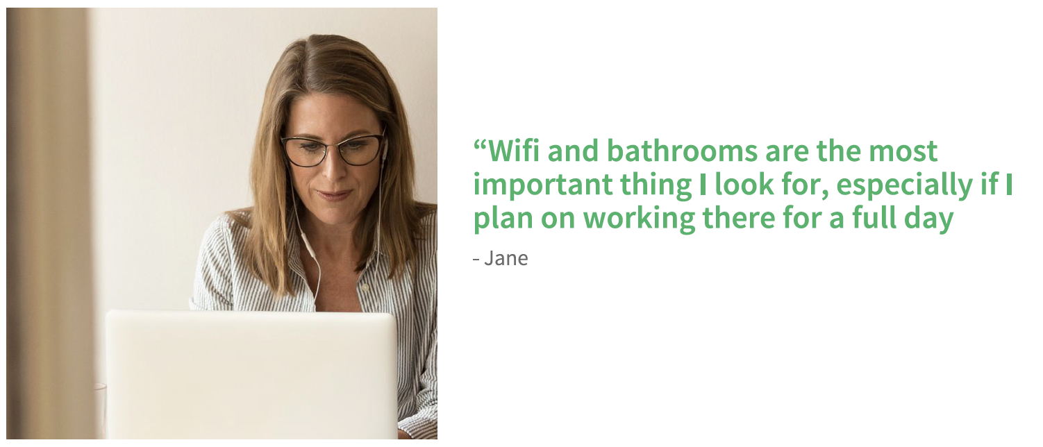
Finding a place to work requires a lot of time and switching between apps. It can be particularly stressful if you are not aware of the area and are also on a time crunch.
Rely on photos and reviews to understand the space and any available amenities. However, there might not be enough pictures to get a true idea of the space, available tables, and what the place has to offer.
Most discussed amenities - good wifi/free wifi, outlets, bathroom, food, and coffee.
Prefer to avoid crowds to focus on work, take calls, and possibly meet with people.
Prefer to be around similar users so they don’t have to feel guilty about taking up space, buying food, or leaving their stuff around.
Maps are easier to use to visualize location and proximities.
User Persona…this is Nina!

Meet Nina! The primary user persona created from the interviewee’s main goals and frustrations. Throughout the design sprint, I refer to Nina and what she might do to gain some guidance and insight. I sketched out some possible end to end solution user flows with Nina in mind. I chose the below user flow as the best possible solution for Nina to find a space to work.

How might we…

Going through these questions, I started to brainstorm ideas that are required to meet the user goals - saving time finding an ideal place to work and finding a place that includes their desired preferences.
The key aspects I wanted to focus on are -
Search by Location
Filter & Sift through options on one screen
Show crowd levels / peak hours
Offer Directions - offering directions to locations while allowing users to stay in the app, as well as avoiding bouncing between a map app and PostUp app
Day 2 - Brainstorm/Sketch
Lightning Demo
To get inspired I referenced similar apps, such as Yelp, Google Maps, Foursquare and Zillow. I took quick screenshots with call outs.
Key highlights from apps that I liked are -
Option to search by map or list
Map Page - one screen to browse and sift through options
Filter options - timing, distance, etc. on the map screen
Drawing map feature to search within the drawn area
Included user based rating system
Timing and highlighting pictures with tags
Search reviews by tags
Crazy 8s Technique
I sketched different variations of my most critical screen with the Crazy 8s Technique. I chose the map page as the most critical screen because the user is able to view the location of all nearby options, filter based on preference, and sift through all spaces.
Solution Sketch
I used one of the critical screens from the Crazy 8s sketches to come up with a solution sketch. A solution sketch is a 3-screen panel board that is a smaller version of a storyboard. The critical screen is in the middle, and I also sketched the previous and next screen. I focused on Nina’s desire to find a space on the critical screen, so in the previous screen she enters in her location as “current location”, and in the final screen she gets directions to the chosen space.
Day 3 - Deciding on a Solution
Storyboard
Since I did a solo sprint, I could only choose from one design solution 😂
However after sleeping on it, I slightly iterated the critical screen so that it was less cluttered. I focused on the 3-panel sketch and added additional screens to complete the story.
Nina has a few hours between meetings and wants to find a place where she can sit and get some work done, or maybe even take a phone call. She wants to find a place with basic amenities.
On the map page, I included the main features of any space, so users can stay on one page to sift through their options. This includes amenities, hours, and a high level idea of what the level of the crowd would be like (to assess if they can grab a table), along with some pictures of the space (to get an idea of the layout). The filtering option allows users to search by their preference. It was a big call out in the interviews that users go through multiple apps or pages to land on a location, so I wanted to reduce the back and forth to save the users some time while they’re quickly searching.
In terms of visual design, I wanted the UI elements to be rounded squares because the name “PostUp” correlates to more square and rectangular shapes. I wanted to include swipe interactions wherever possible to enable quicker motions.
Day 4 - Prototype
Prototyping day...busy day!
Since I was on a time crunch here, about 4 hours to create screens from scratch and prototype, I started off with creating mostly all UI elements needed. This way, I had it available, while I was creating the screens. I tried a few iterations and proceeded with the below.
The first row of images include main screens and the second is the full user flow. I slightly updated layouts from sketches to be more visually pleasing and easier to use.
I created a rapid prototype through Marvel using PNG exports. I was slightly limited with my choice of interactions. However, I tried to include swipe features wherever possible.
Day 5 - Usability Testing
The last day of the design sprint is dedicated to testing the prototype. On Day 1, I sent out a screener to recruit users like Nina - a young professional in a metropolitan area who works remotely in public spaces at least 2-3 times a week. I recruited 5 potential users to get feedback from.
User Scenarios & Tasks
Can the user sign in and search for nearby locations? You signed in and want to quickly see all the locations nearby without entering/typing an address.
Can the user find a nearby location to work from based on their preferences? You want to narrow your search results to a space where you can take a phone call and have meetings, but one that also includes wifi, restrooms, food and drinks.
Can the user browse through their options? You want to sift through your options.
Can the user reference pictures & read reviews? You’ve located a nearby cafe called “Two Hands Cafe”, but you want to make sure it’s the right one to work from.
Can the user reference pictures & read reviews? You’ve located a nearby cafe called “Two Hands Cafe”, but you want to first make sure it fits all your requirements.
Can the user follow the directions to get to the cafe? You’ve decided to go with “Two Hands Cafe”, can you find a way to get there?
Results -
All users completed the task without any difficulty
All users felt the app was extremely intuitive.
Key Insights & Findings -
All users tried to sign in through Google - might be a useful note to integrate Google bookmarks, recognize meeting locations from calendar, etc.
Prefer to see names of location with pins so they don’t have to click on each pin.
Bookmark flags and space pins don’t have enough contrast because the flag did not capture attention. Users felt that the color was too similar and didn’t realize there was a difference at first glance.
Liked that you can draw a map and the option to search in between two locations.
Users wanted the menu or a link to the menu shown on the details page.
Would like options for mode of transportation in directions. The app is currently defaulted to walking and would like the option to switch to car or bike. Not all users like to walk or can walk to a location.


Reflection
Following the GV Design Sprint process taught me to efficiently create a solution with time constraints. Tools such as lightning demo, solution sketching and storyboarding helped spark my creativity while still staying focused. Frankly, I really enjoyed the time limit while I was building the screens because it required me to make an educated decision instantly. It was great to hear that the app validated all of the users’ needs during the testing.
In my future design sprints, I would like to try more risks since it is only a week long challenge. In my original hand sketches, I had an idea to allow users to remove location options on the map while they’re searching, so that they can narrow down to one choice. The next step would be to try this feature in another design sprint for PostUp.
Modified Illustrations